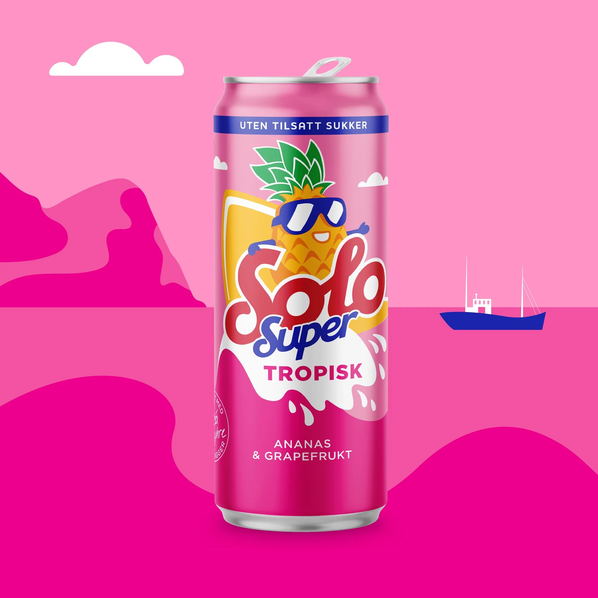
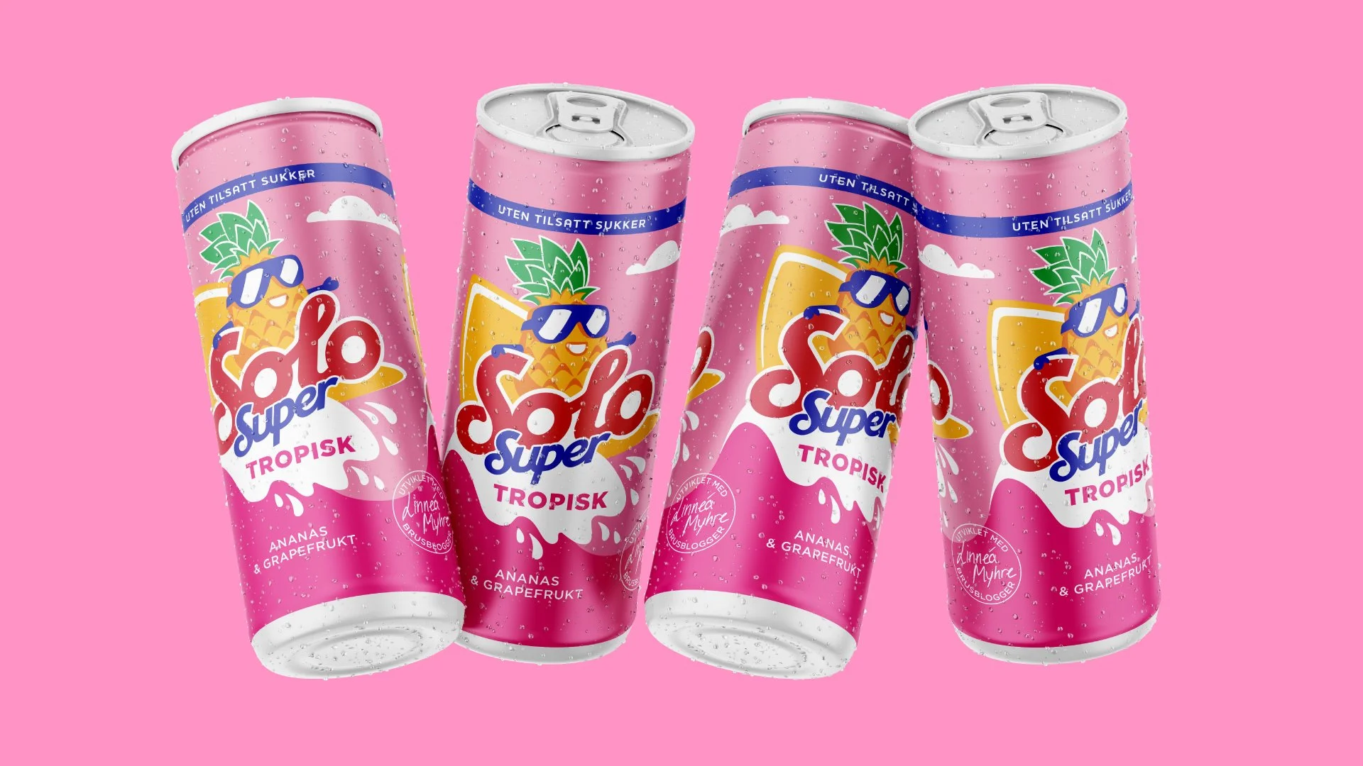
Last year I collaborated with Grid Branding on a super fun packaging project. For a few years now Linnéa Myhre and Solo Super have teamed up and made a special soda together. The first was a Christmas soda, and then they did a summer variety. This time they wanted something tropical with pineapple and grapefruit. I really love the colours they chose! They wanted a surfing pineapple character, and for the background to be inspired by Lofoten in Northern Norway. I really enjoy packaging projects, so this was right up my alley.
Chocolate packaging concept
I really enjoy illustrating packaging, so I decided to illustrate a series of chocolate packaging. Who doesn’t love chocolate, right? I know I do, so here’s a concept of dark chocolate with sea salt, hence the underwater mermaid theme. I also wanted to illustrate the ingredients in a fun way, and make every package stand out, with a distinct colour palette and different hair, but be cohesive at the same time, so the background and the overall layout is the same.
Philadelphia – Japan
Hello, hello! Welcome to my very first news post! :D
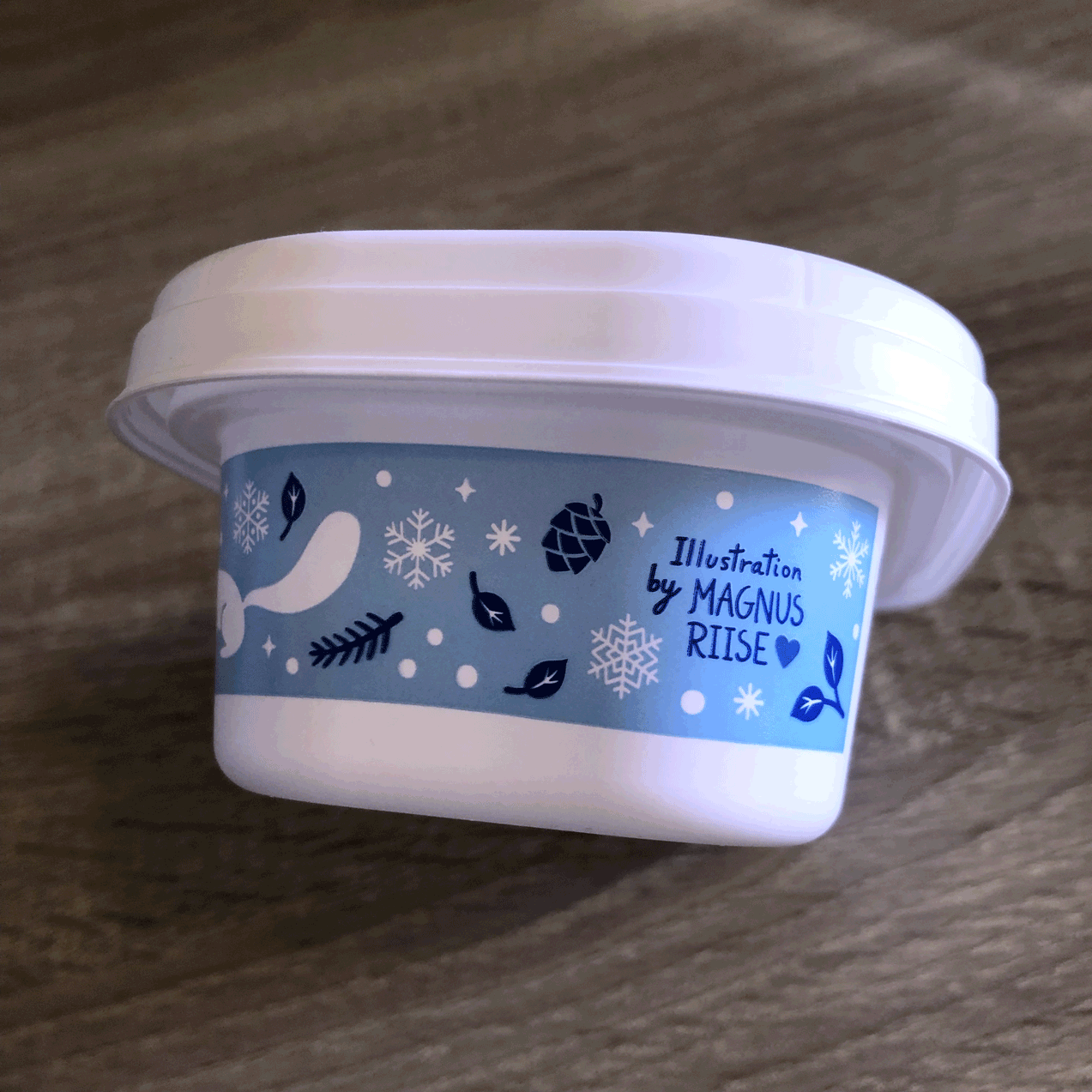
Last year I was commissioned to illustrate a limited edition packaging for Philadelphia cream cheese in Japan, for their winter edition. They wanted a happy design with winter motifs and a soft atmosphere, unrelated to Christmas, with elements of animals and plants suitable for the cold weather. I chose squirrels and small birds that stay in Norway for the cold season. They also wanted some other elements that went with the cosy cold weather theme, so I chose gloves, a matching hat and hot chocolate, among other things.
It was so much fun, and I even got my name on the packaging as well, which was a nice surprise :)


